The ever-changing field of web design still relies heavily on CSS. The addition of new properties to flexbox, like content-visibility, aspect-ratio, @property, and gap, has given developers additional resources to produce designs that are effective, responsive, and aesthetically pleasing. This tutorial provides comprehensive examples to demonstrate the advantages and uses of each of these contemporary and traditional CSS attributes.
content-visibility vs JavaScript Lazy Loading (Traditional Rendering)The content-visibility property in CSS significantly enhances page rendering performance by controlling the rendering of off-screen content, a task that was traditionally managed with JavaScript-based lazy loading.
IntersectionObserver API is used to detect when an image enters the viewport.src attribute is updated from data-src, and the image is loaded.HTML:
<img class="lazy-load" data-src="image1.jpg" alt="Lazy Image">
JavaScript:
document.addEventListener("DOMContentLoaded", function() {
  var lazyImages = [].slice.call(document.querySelectorAll("img.lazy-load"));

  if ("IntersectionObserver" in window) {
    let lazyImageObserver = new IntersectionObserver(function(entries) {
      entries.forEach(function(entry) {
        if (entry.isIntersecting) {
          let lazyImage = entry.target;
          lazyImage.src = lazyImage.dataset.src;
          lazyImage.classList.remove("lazy-load");
          lazyImageObserver.unobserve(lazyImage);
        }
      });
    });

    lazyImages.forEach(function(lazyImage) {
      lazyImageObserver.observe(lazyImage);
    });
  }
});
Compatibility: Works in most modern browsers but requires a polyfill for Internet Explorer.
content-visibilitycontent-visibility CSS property enables the browser to skip rendering elements that are not currently visible on the screen, hence speeding up page load times.content-visibility can be applied to any content, such as text and images.HTML:
<div class="content-section">
  <img src="https://webconsultant247.com/wp-content/uploads/2023/07/5980cac528bf4e76997089cf2d0614b4_8_1280.jpg" alt="" />
  <p>Content...</p>
</div>
CSS:
/* Applying content-visibility to improve rendering performance */
.content-section {
  content-visibility: auto;
  border: 1px solid #ddd;
  margin: 10px 0;
  padding: 10px;
}
content-visibilityCompatibility: Supported in Chrome, Edge, and Opera. Not supported in Firefox and Safari as of my last update.
For more detailed information and examples, you can visit the MDN Web Docs on content-visibility.
aspect-ratio vs Padding HackThe aspect-ratio property automatically manages the aspect ratio of elements, a task that previously required extra effort.
padding-top to create an aspect ratio. The percentage is calculated based on the width of the element’s container.HTML:
<div class="aspect-ratio-box">
  <div class="aspect-ratio-box-content">
    <iframe height="100%" width="100%" src="https://www.youtube.com/embed/pfqx2FIOy1E" title="Testimonial for WebConsultant247, Inc." frameborder="0" allow="accelerometer; autoplay; clipboard-write; encrypted-media; gyroscope; picture-in-picture; web-share" allowfullscreen></iframe>
  </div>
</div>
CSS:
/* Creating a 16:9 aspect ratio using the padding-top hack */
.aspect-ratio-box {
  padding-top: 56.25%; /* 16:9 Aspect Ratio */
  position: relative;
}

.aspect-ratio-box-content {
  position: absolute;
  top: 0;
  left: 0;
  right: 0;
  bottom: 0;
}
Compatibility: Works across all browsers.
New Method: aspect-ratio
aspect-ratio property simplifies maintaining an element’s aspect ratio as the viewport size changes.HTML:
<div class="aspect-ratio-container">
<iframe "URL_OF_THE_YOUTUBE_VIDEO" frameborder="0" allowfullscreen></iframe>
</div>
CSS:
/* Setting aspect ratio directly */
.aspect-ratio-container {
  aspect-ratio: 16 / 9;
  background: #f0f0f0; /* For visibility */
}
Compatibility: Supported in Chrome, Firefox, Safari, and Edge.
@property vs Basic CSS Variables:root for global scope) and used with the var() function.HTML:
<h1>Example</h1>
CSS:
/*
Using basic CSS variables for theming */

:root {
  --primary-color: blue;
  --secondary-color: white;
}

body {
  background-color: var(--primary-color); /* Apply the variable */
}
h1 {
  color: var(--secondary-color);
  text-align: center;
}
Enhanced @property
@property rule in CSS allows you to provide additional information about how the custom property should behave.syntax), a default value (initial-value), and whether it should be inherited (inherits).<color>, <length>, <number>, <percentage>, <length-percentage>, and so on.HTML:
<h1>Example</h1>
CSS:
/* Enhanced control with @property */
@property --primary-color {
  syntax: '<color>'; /* Defines the expected value type */
  initial-value: blue; /* Sets the initial color */
  inherits: false; /* Determines if the property should inherit values */
}

@property --secondary-color {
  syntax: '<color>';
  initial-value: white;
  inherits: true;
}

@property --font-weight {
  syntax: '<number>'; /* since font-weight is a number between 100 and 900 */
  initial-value: 900;
  inherits: true;
}


body {
  background-color: var(--primary-color); /* Apply the enhanced variable */
}

h1{
  color: var(--secondary-color);
  text-align: center;
  font-weight: var(--font-weight);
}
Compatibility: Currently supported in Chrome and Edge. Not widely supported in other browsers.
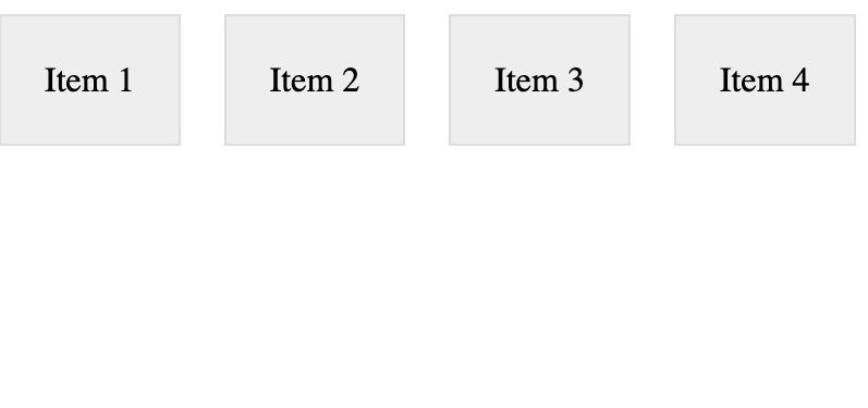
gap in Flexbox vs Marginsgap property, margins were used to create space between Flexbox items.HTML:
<div class="flex-container-margins">
  <div class="flex-item">Item 1</div>
  <div class="flex-item">Item 2</div>
  <div class="flex-item">Item 3</div>
  <div class="flex-item">Item 4</div>
  <!-- More items can be added here -->
</div>
CSS:
/* Using margins for spacing in Flexbox */
.flex-container-margins {
  display: flex;
}

.flex-item {
  margin-right: 20px; /* Right margin for spacing */
  border: 1px solid #ddd;
  padding: 10px;
  background-color: #eee;
  padding: 20px;
}

.flex-item:last-child {
  margin-right: 0; /* Remove margin for the last item */
}

Compatibility: Works in all browsers.
gap in Flexboxgap property introduces a much simpler way to add space between Flexbox items.gap property is a significant improvement, especially in responsive design, where handling margins can become complex.HTML:
<div class="flex-container-gap">
  <div class="flex-item">Item 1</div>
  <div class="flex-item">Item 2</div>
  <div class="flex-item">Item 3</div>
  <div class="flex-item">Item 4</div>
  <!-- More items can be added here -->
</div>
CSS:
/* Using margins for spacing in Flexbox */
.flex-container-gap {
  display: flex;
  gap: 20px;
}

.flex-item {
  border: 1px solid #ddd;
  background-color: #eee;
  padding: 20px;
}

.flex-item:last-child {
  margin-right: 0; /* Remove margin for the last item */
}

Compatibility: Supported in all modern browsers, including Chrome, Firefox, Safari, and Edge.
content-visibility is more useful for long pages, while JavaScript lazy loading might be more appropriate for image-heavy sites.