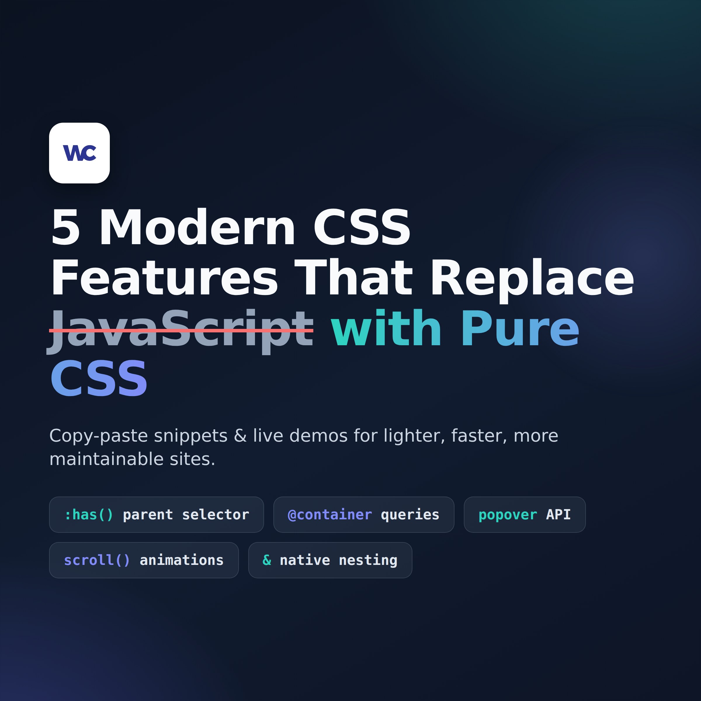
If you learned CSS more than a few years ago, there’s a good chance you’re still writing JavaScript for things the browser can now do on its own. Fade-in-on-scroll effects, tooltips and dropdown menus, styling a parent based on its children, components that adapt to the space they’re given — all of these used to require a script, a library, or a plugin. In 2026, they don’t.
That matters for more than bragging rights. Every script you remove is less code to load, fewer things to break, and a faster site — which helps your Core Web Vitals and, by extension, your SEO. In this tutorial we’ll walk through five modern CSS features that are ready for production use. Each one comes with a copy-paste snippet and a live demo right here in the page, so you can see the effect before you ever touch your stylesheet.
For decades, CSS could only style downward: a parent could style its children, but never the reverse. The :has() pseudo-class changes that. It lets you select an element based on what’s inside it — or what state its children are in.
Live demo — type an invalid email, then a valid one, and watch the field react with zero JavaScript:
No classes toggled, no validation script — the browser tracks the state.
The CSS:
/* Style the whole field wrapper when the input inside it is invalid */
.form-field:has(input:invalid:not(:placeholder-shown)) {
  border-left: 4px solid #e63946;
  background: #fff5f5;
}

/* And when it's valid, show a calm green accent */
.form-field:has(input:valid:not(:placeholder-shown)) {
  border-left: 4px solid #2a9d8f;
}
The HTML:
<div class="form-field">
  <label for="email">Email</label>
  <input type="email" id="email" placeholder=" " required>
</div>
.card:has(img) {
  padding: 0;
  overflow: hidden;
}

.card:not(:has(img)) {
  padding: 2rem;
  background: linear-gradient(135deg, #f8f9fa, #e9ecef);
}
This is especially handy in WordPress, where you don’t always control whether an editor adds a featured image to a card. :has() is supported in current Chrome, Edge, Firefox, and Safari, so you can use it without fallbacks for most audiences.
Media queries ask “how wide is the screen?” Container queries ask “how wide is the box this component lives in?” — which is almost always the question you actually wanted to ask. A card in a narrow sidebar and the same card in a full-width section can now lay themselves out differently, automatically.
/* 1. Declare the parent as a container */
.card-wrapper {
  container-type: inline-size;
  container-name: card;
}

/* 2. Default (narrow) layout: stacked */
.card {
  display: flex;
  flex-direction: column;
  gap: 1rem;
}

/* 3. When the CONTAINER is at least 480px wide, go horizontal */
@container card (min-width: 480px) {
  .card {
    flex-direction: row;
    align-items: center;
  }
  .card img {
    flex: 0 0 40%;
  }
}
Drop that same card into a sidebar, a footer widget, or a hero section, and it adapts to each spot without a single page-level media query. If you build reusable blocks or work with page builders like Divi or Gutenberg, this is the feature that finally makes “write once, use anywhere” true for layout.
Tooltips, dropdown menus, and “more info” bubbles used to mean a JS library (and its accessibility bugs). The HTML popover attribute now handles open/close behavior, light-dismiss (clicking outside closes it), the Esc key, and stacking on the browser’s top layer — all natively.
Live demo — click the button (then click outside, or press Esc, to dismiss):
Weekly backups, security scans, plugin updates, and priority support.
The HTML:
<button popovertarget="pricing-info">What's included?</button>

<div id="pricing-info" popover>
  <h3>Everything in the Care Plan</h3>
  <p>Weekly backups, security scans, plugin updates, and priority support.</p>
</div>
The CSS — including a smooth entry animation using @starting-style:
[popover] {
  border: none;
  border-radius: 12px;
  padding: 1.5rem;
  max-width: 340px;
  box-shadow: 0 10px 40px rgba(0, 0, 0, 0.18);
  transition: opacity 0.25s ease, transform 0.25s ease, display 0.25s allow-discrete;
}

/* Where the animation starts from when the popover opens */
@starting-style {
  [popover]:popover-open {
    opacity: 0;
    transform: translateY(8px);
  }
}
Notice there is no <script> tag anywhere. The button opens it, clicking outside closes it, and keyboard users are handled correctly out of the box.
Those “elements fade in as you scroll” effects that used to require AOS, GSAP ScrollTrigger, or an Intersection Observer script? CSS can now bind an animation directly to scroll position with animation-timeline.
@keyframes fade-rise {
  from { opacity: 0; transform: translateY(30px); }
  to   { opacity: 1; transform: translateY(0); }
}

.reveal {
  animation: fade-rise linear both;
  animation-timeline: view();
  /* Play while the element travels from entering the viewport to 30% up */
  animation-range: entry 0% entry 30%;
}
@keyframes grow-bar {
  from { transform: scaleX(0); }
  to   { transform: scaleX(1); }
}

.progress-bar {
  position: fixed;
  top: 0; left: 0;
  height: 4px;
  width: 100%;
  background: #4361ee;
  transform-origin: left;
  animation: grow-bar linear;
  animation-timeline: scroll(root);
}
Because these run off the browser’s compositor instead of firing JavaScript on every scroll event, they’re dramatically smoother on low-end phones. Support note: scroll-driven animations are the newest feature on this list — solid in Chromium browsers, with Firefox and Safari support rolling out. Treat the effect as a progressive enhancement and wrap anything that animates opacity in an @supports (animation-timeline: view()) block so unsupported browsers never hide your content.
If you’ve used Sass, you already know why nesting is pleasant. The difference in 2026 is that you no longer need Sass, a compiler, or any build tooling — browsers understand nesting natively, which is perfect for WordPress child themes and quick client customizations.
Live demo — hover the card; the lift and shadow are pure CSS:
The CSS — everything about the component lives in one nested block:
.pricing-card {
  border: 1px solid #e0e0e0;
  border-radius: 12px;
  padding: 2rem;
  transition: box-shadow 0.2s ease, transform 0.2s ease;

  &:hover {
    box-shadow: 0 12px 30px rgba(0, 0, 0, 0.1);
    transform: translateY(-4px);
  }

  h3 { margin-top: 0; font-size: 1.25rem; }

  .price {
    font-size: 2.5rem;
    font-weight: 700;

    span { font-size: 1rem; color: #6c757d; }
  }
}
Paste it straight into “Additional CSS” in the WordPress Customizer and it just works — no build step required.
You have three good options, in order of preference. Child theme stylesheet: add the CSS to your child theme’s style.css so it survives theme updates. Customizer → Additional CSS: quick and safe for small additions. Per-block custom CSS: Divi modules have an Advanced → Custom CSS tab, and in Gutenberg you can add a class to a block and target it from either location above. For the Popover example you’ll also need the HTML markup — use a Custom HTML block in Gutenberg or a Code module in Divi.
Four of the five — :has(), container queries, the Popover API, and native nesting — are supported in all current versions of Chrome, Edge, Firefox, and Safari. Scroll-driven animations are newer: support is solid in Chromium browsers and arriving in the others, so use them as a progressive enhancement and verify current support on caniuse.com.
Indirectly, yes. Replacing scroll-animation and tooltip libraries with native CSS reduces the JavaScript the browser must download, parse, and execute, which improves Core Web Vitals metrics like INP and LCP. Google uses page-experience signals in ranking, and faster pages also convert better.
Yes. These are standard CSS features, so they work in any theme or builder. Add the styles through your child theme, the Customizer’s Additional CSS panel, or the builder’s own custom CSS fields. Builders sometimes add extra wrapper divs, so you may need to adjust selectors to match the real markup.
For most sites, no. Native nesting covers the most-loved Sass feature, CSS custom properties replace Sass variables, and functions like calc(), clamp(), and color-mix() handle the math. Large design systems may still benefit from a build step, but a typical business or practice website can now be styled entirely with vanilla CSS.
CSS is forgiving: unknown rules are simply ignored. A browser that does not understand animation-timeline shows the content without the animation; one that does not understand :has() skips that rule. Wrap anything that could hide content in an @supports check and your site degrades gracefully instead of breaking.
Modern CSS has quietly become one of the best performance upgrades available to small business websites — less JavaScript, faster pages, and effects that used to require a developer on retainer. If you’d like help modernizing your site’s front end (or auditing which plugins and scripts you can safely remove), get in touch — it’s what we do all day.