Imagine a potential client, already anxious about reaching out, landing on your therapy website. They use a keyboard instead of a mouse because of a motor condition, or they read with a screen reader, or bright animations make them dizzy. If your site quietly shuts them out, they won’t email you to complain — they’ll simply close the tab and try the next therapist on the list.
Roughly one in four adults in the U.S. lives with some form of disability. For a counseling or private practice website, accessibility isn’t just a legal checkbox — it’s the online version of a wheelchair ramp at your office door and a warm voice on the phone. The good news: in 2026 you don’t need a developer to make big improvements. Here are six fixes you can apply this week, plus a 10-minute self-audit at the end.
Three things have changed the landscape. First, the current benchmark is WCAG 2.2 (Web Content Accessibility Guidelines), and U.S. courts routinely reference WCAG conformance in ADA website cases — small local businesses, including health and wellness practices, are common targets for demand letters. Second, government-run entities in the U.S. are now hitting hard ADA Title II compliance deadlines in 2026–2027, which is raising the bar (and public awareness) for everyone else. Third, and most importantly for you: accessible websites simply convert better. Clear headings, readable text, and keyboard-friendly buttons help every visitor — especially someone in distress who has limited patience for a confusing site.
There’s also a quiet SEO bonus. Many accessibility fixes — proper headings, alt text, descriptive links — are exactly what search engines reward. Let’s get into the fixes.
Therapy websites love soft, soothing palettes — pale sage text on cream backgrounds, light gray paragraphs, gentle pastels. Unfortunately, “calming” often means “low contrast,” and low contrast makes text genuinely unreadable for visitors with low vision or color blindness (and hard for anyone on a phone in sunlight).
The standard to aim for is a contrast ratio of at least 4.5:1 for normal body text. You can test any color pair in seconds with the free WebAIM Contrast Checker — paste in your text color and background color and it gives you a pass/fail. The trick is that you don’t have to abandon your calming brand: keep your soft sage and dusty blue for backgrounds, buttons, and decorative sections, but darken the text itself. A deep green-gray like #2f4f43 on cream feels every bit as serene as pale sage — your visitors just get to actually read it.
Many visitors navigate with the Tab key instead of a mouse — because of motor impairments, screen readers, or simple preference. Try it on your own site right now: click into the page and press Tab repeatedly. Can you see which link or button is selected? On many WordPress themes the focus outline has been removed for looking “ugly,” which leaves keyboard users completely lost — they can’t tell when they’ve reached your most important button.
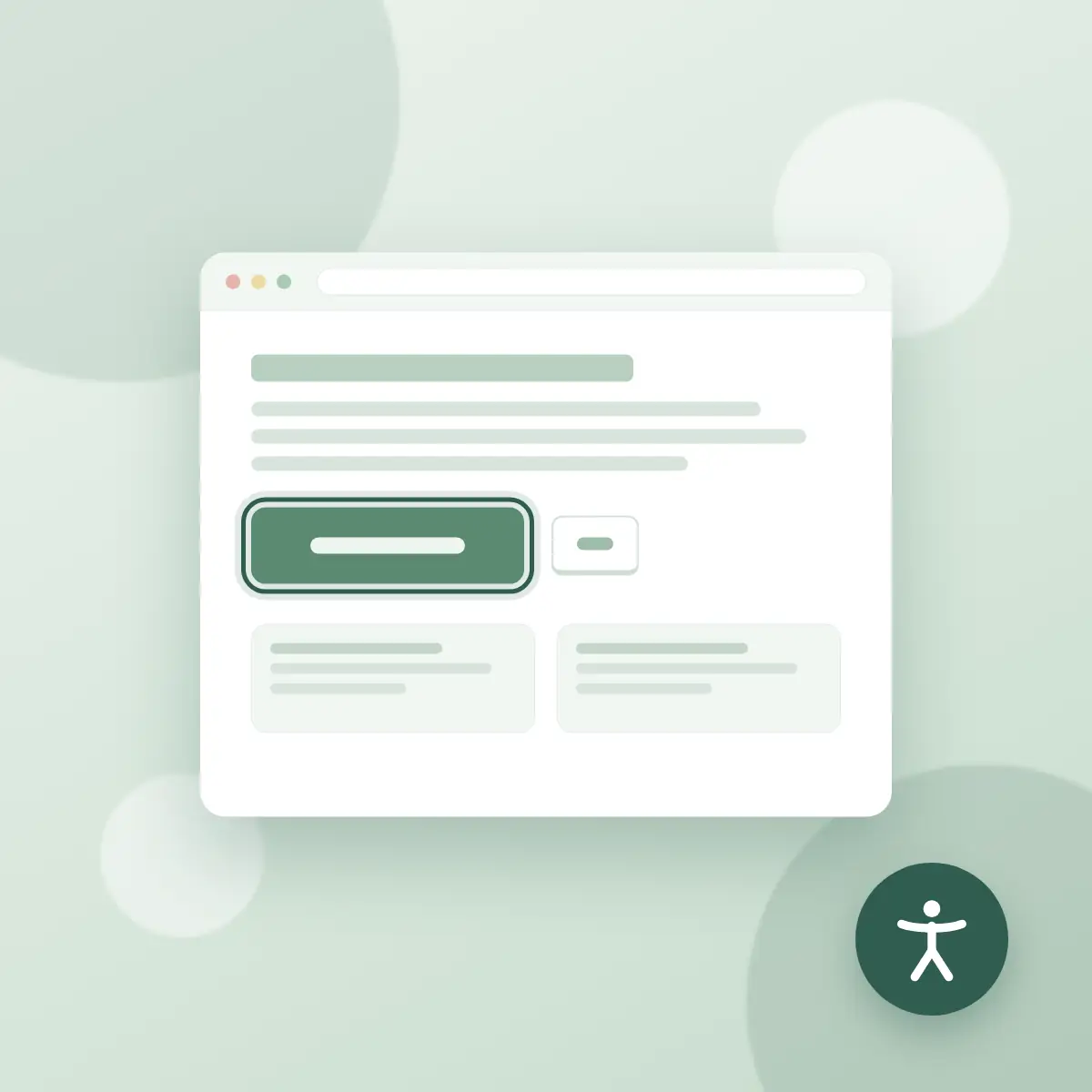
The fix is a visible focus ring that matches your brand. Here’s a live example — click inside the box below, then press Tab:
Live demo: click inside this box, then press the Tab key to see the focus ring appear.
And here’s the CSS. In WordPress, paste it into Appearance → Customize → Additional CSS and adjust the class name and colors to match your theme’s booking button:
/* A calm, on-brand focus ring for your booking button */
.book-session-btn {
  background: #5b8a72;
  color: #ffffff;
  padding: 14px 28px;
  border: none;
  border-radius: 8px;
  font-size: 1rem;
  cursor: pointer;
}

/* Only shows for keyboard users - mouse clicks stay clean */
.book-session-btn:focus-visible {
  outline: 3px solid #2f5d50;
  outline-offset: 3px;
  box-shadow: 0 0 0 6px rgba(91, 138, 114, 0.25);
}
The :focus-visible selector is the modern touch: the ring appears for keyboard users but stays hidden on ordinary mouse clicks, so your design stays clean for everyone else.
Every meaningful image on your site needs alternative text — the short description a screen reader speaks aloud. In WordPress, click any image in the Media Library or the editor and fill in the “Alternative text” field. A few guidelines for a practice website:
Describe what matters, not the file: “Therapist Dana Lee smiling in her Denver counseling office” beats “IMG_2047” or “headshot.” Keep it under one sentence. If an image is purely decorative — a soft texture, an abstract divider — leave the alt field empty so screen readers skip it instead of reading noise. And never stuff keywords: alt text is for humans first, and screen-reader users can tell when they’re being marketed to.
Parallax scrolling, auto-playing sliders, and floaty animations can trigger dizziness, migraines, or anxiety in people with vestibular disorders — arguably the last thing a therapy website should do. Modern operating systems let users switch on a “reduce motion” preference, and your site can honor it with one small CSS block:
/* Respect the visitor's "reduce motion" system setting */
@media (prefers-reduced-motion: reduce) {
  *,
  *::before,
  *::after {
    animation-duration: 0.01ms !important;
    animation-iteration-count: 1 !important;
    transition-duration: 0.01ms !important;
    scroll-behavior: auto !important;
  }
}
Paste this at the bottom of your Additional CSS. Visitors who’ve asked their device for less motion get a still, calm page; everyone else sees your site exactly as designed. It’s a two-minute change that quietly says “we thought of you.”
Placeholder-only forms — where the field name appears in gray inside the box and vanishes when you start typing — are an accessibility trap. Screen readers often can’t announce them, and anxious visitors lose track of what a half-filled field was asking for. Every field on your contact or consultation-request form needs a visible label sitting above it, connected in the code:
<label for="client-message">How can we help?</label>
<textarea id="client-message" name="client-message" rows="4"></textarea>
The for attribute matching the field’s id is what links them for assistive technology. If you use a form plugin like WPForms, Gravity Forms, or Fluent Forms, you don’t need to touch code — just make sure the “hide labels” or “placeholder only” option is switched off in the form settings. While you’re in there, check that error messages say what went wrong in plain language (“Please enter your email address”) rather than turning a border red and hoping for the best.
Screen-reader users often navigate by jumping from heading to heading, the way sighted visitors skim. That only works if your headings are real headings in a sensible order: one H1 (your page title), H2s for major sections like “Services” or “About,” and H3s nested underneath. In the WordPress editor, use actual Heading blocks — never a paragraph that’s just been made big and bold.
While you’re at it, give body text room to breathe: at least 16px font size, line height around 1.6, and short paragraphs. Descriptive link text helps too — “Read about our anxiety counseling” tells a screen-reader user where a link goes; a bare “click here” tells them nothing.
Here’s a quick routine to run on your homepage and your contact page. First, run the free WAVE browser extension (wave.webaim.org) and note any red errors — missing alt text, empty links, and contrast failures are the usual suspects. Second, put your mouse away and Tab through the entire page: you should be able to reach and activate every menu item, link, and your booking button, and always see where you are. Third, open Chrome’s built-in Lighthouse report (right-click → Inspect → Lighthouse) and run the Accessibility category for a scored checklist. Fix the red items first, then work down the list one tip at a time — accessibility is a practice, not a one-day project. Your future clients, all of them, will feel the difference.
Private practices are generally covered by ADA Title III as places of public accommodation, and U.S. courts routinely treat an inaccessible website as a barrier under the ADA, usually referencing WCAG standards. There is no small-business exemption, so aiming for WCAG 2.2 AA is the safest and kindest target.
WCAG 2.2 is the current version of the Web Content Accessibility Guidelines, the international standard for accessible websites. Level AA is the widely accepted benchmark — it covers color contrast, keyboard access, visible focus, form labels, and clear structure.
No. One-line overlay widgets do not fix the underlying code, and sites using them have still been sued. Real fixes — contrast, labels, alt text, keyboard support — are more effective and usually simpler than they sound.
Not at all. You keep your soft palette for backgrounds and accents while darkening text for contrast, and focus rings can be styled in your brand colors. Most fixes are invisible to visitors who don’t need them — and make the site feel calmer and clearer for everyone.
Run the free WAVE extension from WebAIM, use Chrome’s built-in Lighthouse accessibility report, and do a manual keyboard test by pressing Tab through your pages. Together these catch the majority of common issues in about ten minutes.