
Therapy Website Photos in 2026: 6 Fixes That Book Clients
Open five therapy websites in your town and you will see the same four pictures: an empty couch with a box of tissues, two hands clasped across a table, a single smooth stone balanced on another stone, and a sunrise. None of them tells a prospective client the one thing she is trying to work out, which is what it will be like to sit in a room with you. Your photographs are doing less work than almost anything else on the site, and they are the easiest part to fix.
Why this is worth an afternoon
A person choosing a therapist is making a judgment about safety with almost no information. She cannot assess your training. She has no way to compare outcomes. So she looks at your face, reads two paragraphs, and decides whether she could say the hard thing out loud to you.
Stock imagery gives her nothing to decide with, and worse, it signals that the practice is generic. A real photograph of a real person in a real room is not a style preference. It is the closest thing to evidence she has.
Book one hour with a local photographer
Not a studio session, not a package, not a friend with a nice camera. An hour with someone who photographs people for a living.
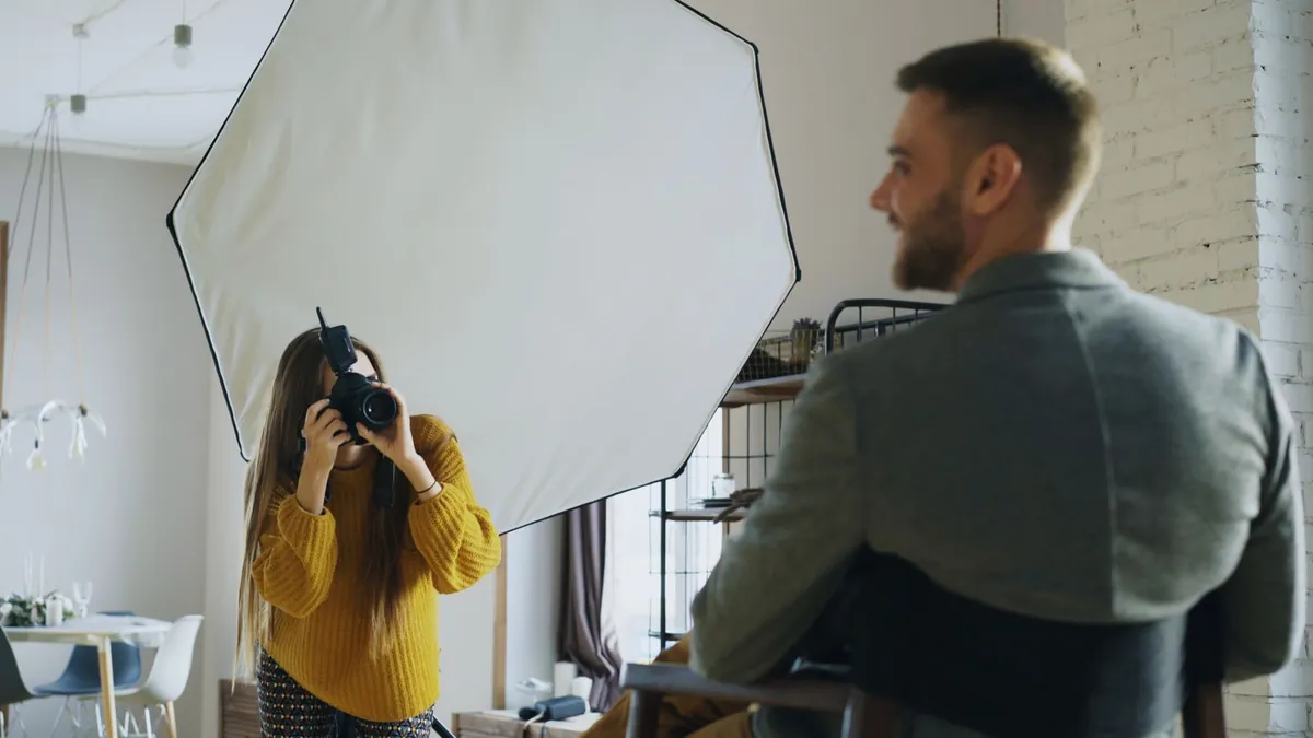
Search for headshot photographers in your area and look for portraits where the subject seems comfortable rather than polished. Tell them plainly what the pictures are for: a therapy practice, and the goal is approachable rather than corporate. A good photographer will spend the first ten minutes getting you to stop performing, which is most of the job.
If the budget genuinely is not there this month, a phone camera near a large window, with someone else pressing the button, beats any purchased image of a couch. Shoot in the late morning, stand a couple of feet back from the window rather than against it, and take forty frames.
Time: an hour of shooting, a week or two of waiting.
Ask for three shots, not thirty
Photographers will offer a gallery. You need three images and it helps enormously to say so in advance:
One head-and-shoulders portrait, looking at the camera, uncluttered background. This is your About page, your directory profile, your Google Business Profile. Same picture in all three.
One slightly wider shot of you in your actual working space, not looking at the camera. This is your home page.
One picture of the room a client will sit in, with nobody in it.
Ask for them in both landscape and portrait crops, because your website and your directory profile want different shapes, and cropping a tight headshot afterward never goes well.
How to know it worked: you can fill every image slot on the site from three files.
Time: five minutes of asking, before the shoot.
Photograph the room people will actually sit in
Tidy it, do not stage it. A client who sees the real room recognizes it when she arrives, and that small moment of recognition takes some of the edge off a first session.
Shoot it in daylight with the lamps on. Include the chair she will sit in. Leave the tissues where they normally are rather than arranging them into a composition. If the room is small, say so on the page instead of shooting it through a wide lens that makes it look like somewhere else — the disappointment on arrival costs more than the flattering photo gained.
If you practice only online, photograph your actual video setup instead. It answers the same question: what will I be looking at.
Time: fifteen minutes, during the same hour.
Retire the couch, the lotus and the sunset
Go through the site and remove every stock image that could appear on any therapist’s website anywhere. In most cases you will find you do not need a replacement — a well-set paragraph with room around it reads better than a decorative photograph with nothing to say.
Where an image genuinely helps, prefer something specific over something calming: the building entrance, the street, the waiting area, the view from the chair. Those are useful to a nervous person. A sunrise is not.
How to know it worked: nothing left on your site could be swapped onto a competitor’s site without anyone noticing.
Time: half an hour.
Resize the files before you upload them
A modern camera produces images of fifteen to twenty-five megabytes. Put one of those on a home page and a client on a phone waits several seconds before she sees anything, which on a slow connection is long enough to leave.
Export at around 1,600 pixels wide for a full-width image and 800 for anything smaller, save as WebP or a good-quality JPEG, and check that the result is measured in kilobytes rather than megabytes. A hero image somewhere around a hundred kilobytes is normal and looks perfectly sharp.
This single step is often the largest speed improvement available on a therapy website, because photographs are usually the heaviest thing on the page.
How to know it worked: run the page through Google’s PageSpeed Insights on mobile before and after.
Time: twenty minutes for a whole site.
Write alt text a screen reader can use
Every image needs a short description of what is in it, written for someone who cannot see it. Not a keyword, and not a caption.
"A woman sitting in an armchair by a window, looking at the camera" is good alt text. "therapist Chicago anxiety counseling" is not — it is unhelpful to the person who needs it and search engines stopped rewarding it a long time ago. Purely decorative images should have empty alt text so a screen reader skips them rather than announcing a filename.
How to know it worked: read your alt text aloud with your eyes shut and see whether you can picture the page.
Time: fifteen minutes, and it is also an accessibility improvement.
If you only do one thing
Replace the stock photograph on your About page with a real picture of you, and use the same picture on your Google Business Profile and your directory listing. It is the cheapest change on this list and the one a prospective client actually uses.
Everything else — the room, the sizing, the alt text — makes that picture work harder, but the picture is what changes her mind.
If resizing images is the part you would rather not think about again, it is a standard part of ongoing website maintenance. If the photographs are heavy enough to be slowing the site down, the seven speed fixes for a therapy website covers what else is usually wrong. And if you want the pictures, the words and the layout handled together, that is what building a website for a therapy practice involves — book a free consultation and we can talk through what you already have.